Business
Where To Place Payment Forms On Your Website For The Highest Conversion Rate


Dodd Caldwell
July 21, 2020


(Guest post by Robojuice)
There are myriad factors that impact the conversion rate of your website’s payment form. One of the factors that makes the biggest impact is placement.
When your payment form isn’t converting well, there’s a high chance it’s in the wrong location. Placing your payment form in the right location can do more than boost conversion rates, however — it can also eliminate technical bugs that stop users from paying you.
The Short Answer To “Where Should I Place My Payment Form?”
There are two places forms belong:
- Above the fold on your payment page
- At the bottom of your product pages
You don’t need to place your payment form in more locations on your website — it will actually hurt your conversion rate if you do.
Now, there are finer details you won’t want to miss. The devil is in the details. (Or in this case, your payments are in the details.)
At Robojuice, we put a lot of time into making sure forms convert. The decision of where and how a form is placed on a website is a big factor that affects conversion rates. For example, one of our client’s conversion rate increased 300% by doing one thing: They linked their call-to-action button to a landing page with its own form. Let’s dive into what you should consider when deciding where to place payment forms.
Payment Forms Need A Dedicated Page And Dedicated Call-To-Action
Payment forms always need to be on a dedicated page. “Always” meaning always. This dedicated and exclusive page will be called your “payment page.” Your payment page can be structured one of two ways:
- A standard page
- A minimal page
A Standard Page
A standard page consists of your website’s main navigation, footer, logo, and form. It shouldn’t have a sidebar or any other elements that distract the customer from submitting a payment. Be sure to place your payment form at the highest point on the page as you can — typically, right after the main navigation section.
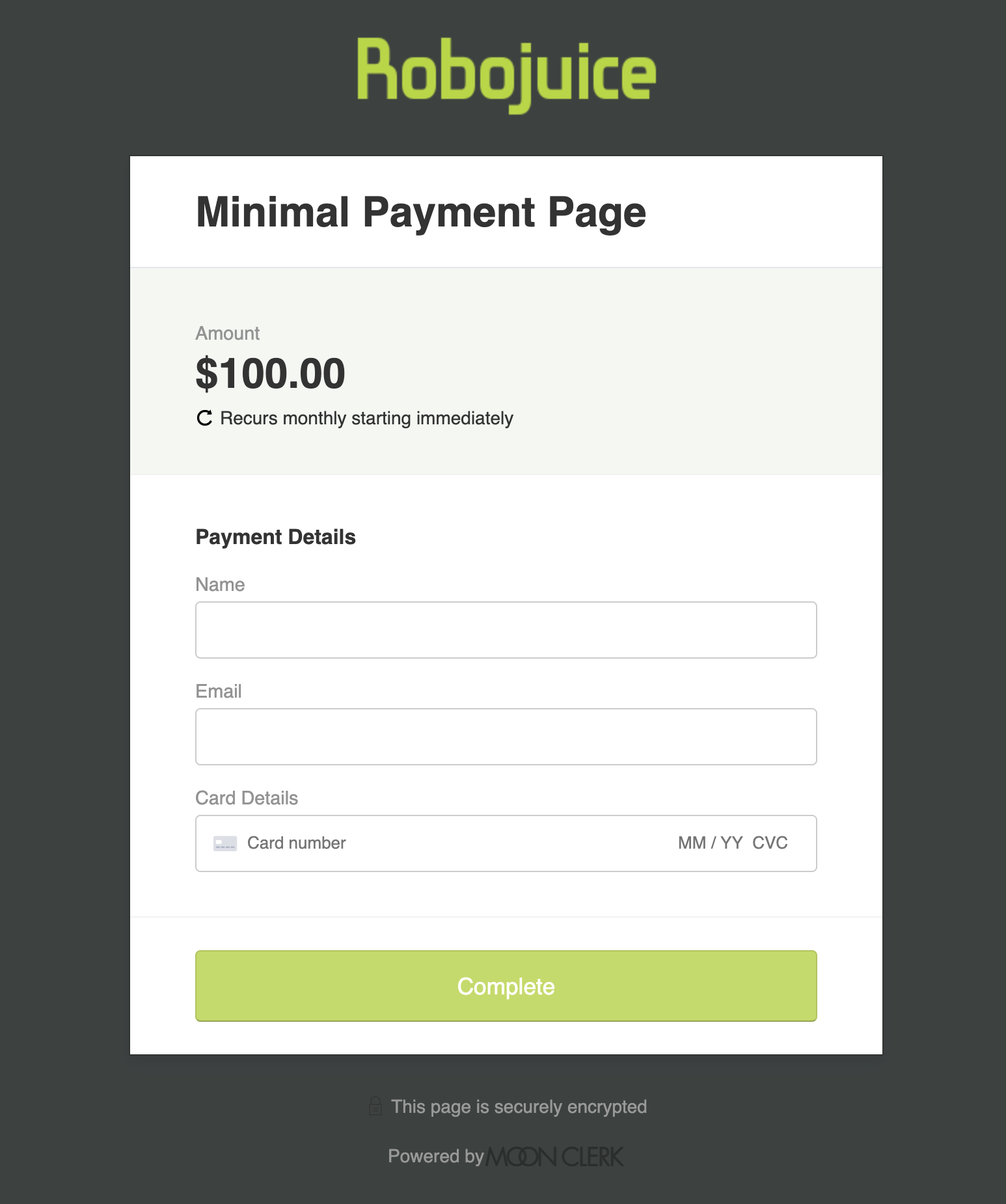
A Minimal Page
While a standard page with a properly-placed form will convert well, a minimal page will usually convert better.
What is a minimal page? Unlike a standard page that has four parts: navigation, footer, logo, and form, a minimal page only has two parts: your logo and payment form. (If your company isn’t well known, you may also want to include a recognized security icon or trust badge.)
Minimal pages are used by the big players like Amazon, eBay, and many more. They work for several reasons:
- Without a navigation bar and footer, there are no extra links for customers to click.
- A minimal page increases a customer’s sense of security.
- When customers are ready to pay, they want to pay fast. A minimal page will help them fill out your payment form without extra scrolling and clicking.
How Do You Get A Minimal Page?
MoonClerk. Every MoonClerk form comes with a minimal page already made for your business.
That minimal page is the default page you get with MoonClerk. What’s even better is that you can customize your minimal payment page to your brand with a theme. This is a big reason we at Robojuice recommend MoonClerk to our clients who need a quick and easy payment form.
Another reason we recommend MoonClerk is because not every website comes with the option to create a minimal page. If you have a custom website with the option to add a minimal page, then use it for your payment form. If you are a MoonClerk customer, it’s easy to embed your payment form on that page.
Special Considerations For Product Pages
When you have different payment forms for different products, it can make sense to have the appropriate payment form directly on your product pages.
In this situation, you should place your payment form at the bottom of your product page, just above your website’s footer. Do not put it above the content — when customers are visiting a product page, they’re typically not ready to buy yet.
But how will customers find your form if it’s at the bottom of the page? Simply add a “jump-to” call-to-action button that makes it convenient to access the form when customers are ready.
For example, if you visit our website at http://robojuice.com/moonclerk-jump, you’ll see a “jump-to” call-to-action button. When you click that button, it “jumps” you to the bottom of the page where our form is located (just above the footer).
To create a “jump-to” call to action button, you need a jump-link. If you’re using a MoonClerk payment form, you’ll receive a link with a unique ID that you can use as your jump-link.
You can place your “jump-to” call-to-action button anywhere on your product page, even in multiple locations. (Note that jump-links should only be used to link to a section of the page your customer is already visiting.)
Finally, make sure your call-to-action button uses clear words like “Pay Now,” “Buy Now,” or “Pay for Ticket.” Customers should be able to tell exactly what action will happen when they click a button.
Considerations For Your Call-To-Action Button
Once you have your product page ready, don’t forget to optimize your call-to-action button. Here are a few tips that will increase your conversion rates:
- Your button should be a button, not just a link.
- Your button should use clear words that describe the action.
- Your button should not be placed on your dedicated landing page, since these pages are payment form-focused, but it should be placed on as many pages as it makes sense to add it to. On those pages, place the button where it can be seen easily.
The Do-Not-Do List
When adding a payment form, there are a few things you should avoid at all costs.
- Don’t put your payment form in a sidebar or other awkward location.
- Don’t place your payment form in a pop-up or modal box. A long form in a pop-up box will almost always have bugs and will have little to no conversions.
- Don’t put your payment form on a hidden page. Your dedicated payment page should always be linked to in your footer and in your main navigation.
While it’s smart to test a variety of elements to see if modifications impact your conversion rates (such as button color and page layouts), you’ll find that proper form placement will have a guaranteed payoff. If you implement these best practices for your payment forms, you’ll see your conversion rates rise.
This is a guest post by Robojuice. Robojuice takes the worry out of web by providing direction for companies that want to win online. They specialize in turning your website visitors into prospective customers.